Our Rainbow Flag, an internationally recognized emblem of pride for gay, lesbian, bisexual, transgender and queer (GLBTQ) people throughout the world debuted today, June 25, 1978! Happy Pride Day to us all!

The rainbow flag was designed by Gilbert Baker as a symbol of our community’s pride and social movement. In 1974, following his discharge from military service, Baker moved to San Francisco, California, USA. He became a friend of city councilperson Harvey Milk who challenged him to create an emblem of joy and pride for the GLBTQ community. His creation made its world debut at that year’s Gay Freedom Day Parade in San Francisco on this exact same date.

The above image explains the significance of the selected colors chosen by Gilbert Baker. The flag was immensely popular with the Pride Parade participants and spectators and was incorporated by municipal communities immediately after the event. The feeling at that time was that finally a positive image now represents our people and our struggle! In order to provide universal appeal to all persons, the banner intentionally avoided any illusion to ethnicity or to race.
At that time, Baker’s decision to exclude any reference as to heritage was understood but not without criticism. There were some within our community who felt that the diversity of our descent should be included!
However, as our struggle for acceptance as a legitimate civil rights movement was still relatively new, the majority of us welcomed the new concept and the unique symbol created by Gilbert Baker. Importantly, the “rainbow” image was attractive and colorful and a most pleasing as it replaced the pink triangle – a design implemented through the Nazi oppression of homosexuality within the concentration camps of Europe.
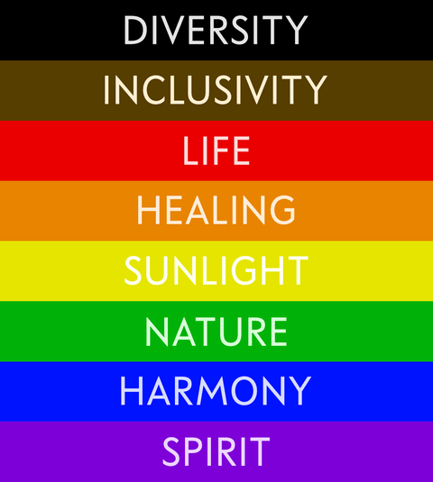
The dissatisfaction of the community remained and in 2017, the City of Philadelphia, Pennsylvania, USA, used the above 8 stripe version of Baker’s design for its municipal GLBTQ celebrations with the two additional colors. The thought for the extra colors were to include both “diversity” and “inclusivity” into the representations of our community. The concept was welcomed by community but was considered by many as not achieving the goal of total inclusion and cohesion.

The Progress design for the traditional GLBTQ community flag was created by David Quasar (shown above). This variation features the original designed by Baker and includes the additional colors added by Philadelphia to represent both diversity and inclusiveness. The chevron (insert) is to show progress. The colors included within the chevron reflect all persons of color, transgender people and those living with HIV/AIDS. Quasar explained: “the chevron’s arrow points to the right to show forward movement while being along the left edge shows that ‘progress’ still needs to be made.”

With the sky as a background, a goal, a fulfillment, here’s wishing to everyone reading ReNude Pride the very best as we now bring this 2021 Pride month to a close!
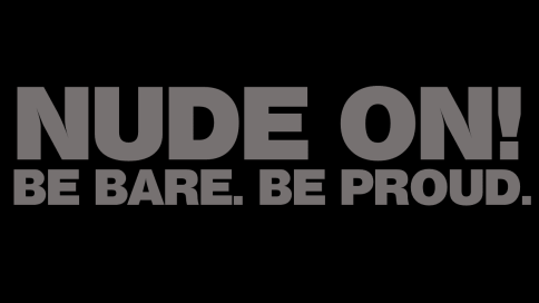
Take care and stay bare!
Naked hugs!
Roger Poladopoulos/ReNude Pride

Author’s Note: The next planned post entry is for this upcoming Sunday, June 27, 2021, and the proposed topic is: “USA: HIV Testing Day!”

I like to keep calm and stay naked all the time to watch but and penis in naked people and touch it
LikeLike
It’s a beautiful flag
LikeLiked by 1 person
Yes, indeed it is! Very inspiring! 🙂
LikeLike
This was a very interesting post about the history of the pride flag. I always do a lesson with my students wherein they create their own version of an American Revolutionary War era flag. They have to explain the symbolism and the meaning behind the choices they made in their flag design. Your explanation of the pride symbols reminded me of that assignment!
LikeLiked by 1 person
Thank you for your observation! Hopefully, the flag will inspire future generations! 🙂 Take care and stay bare!
LikeLike